FARMACY BREWING: FARM & BREWERYBrand identity for a genuine farmhouse brewery.
The genuine farm-house brewery that does it all gets the holistic branding it deserves.

PROJECT COMPONENTSClient
Farmacy Brewing
My Role
Independent Design Lead
Services
Brand Identity, Packaging, Web Design + Illustration
Tools
Adobe Illustrator + Photoshop, Squarespace, Asana, & Dropbox
Timeline
12 weeks (March 2018 - June 2018)
DETAILSThe Overview
Nestled in the rolling hills of Baltimore County Farmacy Brewing is a family-owned, genuine farmhouse brewery. Two brothers-in-law with a passion for brewing reconfigured a former horse barn to house the brewery.
Farmacy Brewing is rooted in strong values of family, holistic connection, and experimentation. Each brew is made with ordinary farm ingredients, but the results are anything but ordinary.
The Problem
Farmacy Brewing came to me wanting to build a brand identity that set them apart from their competition and the other craft breweries in the Baltimore area. The goal was to encapsulate their values and communicate the unique vision to their audience.
The Brief
As the sole designer on this project, I executed the design process end-to-end. I develop a new brand identity, packaging suite, and website that reflects Farmacy Brewing’s rooted values, crafted products, and appeal to its ever-growing craft beer market.
BREWING THE VISIONAfter many client-facing strategic planning sessions and my own design research, I developed a brand identity that felt unique - one that conveyed the holistic relationship between the brewery, the farm, and the family.
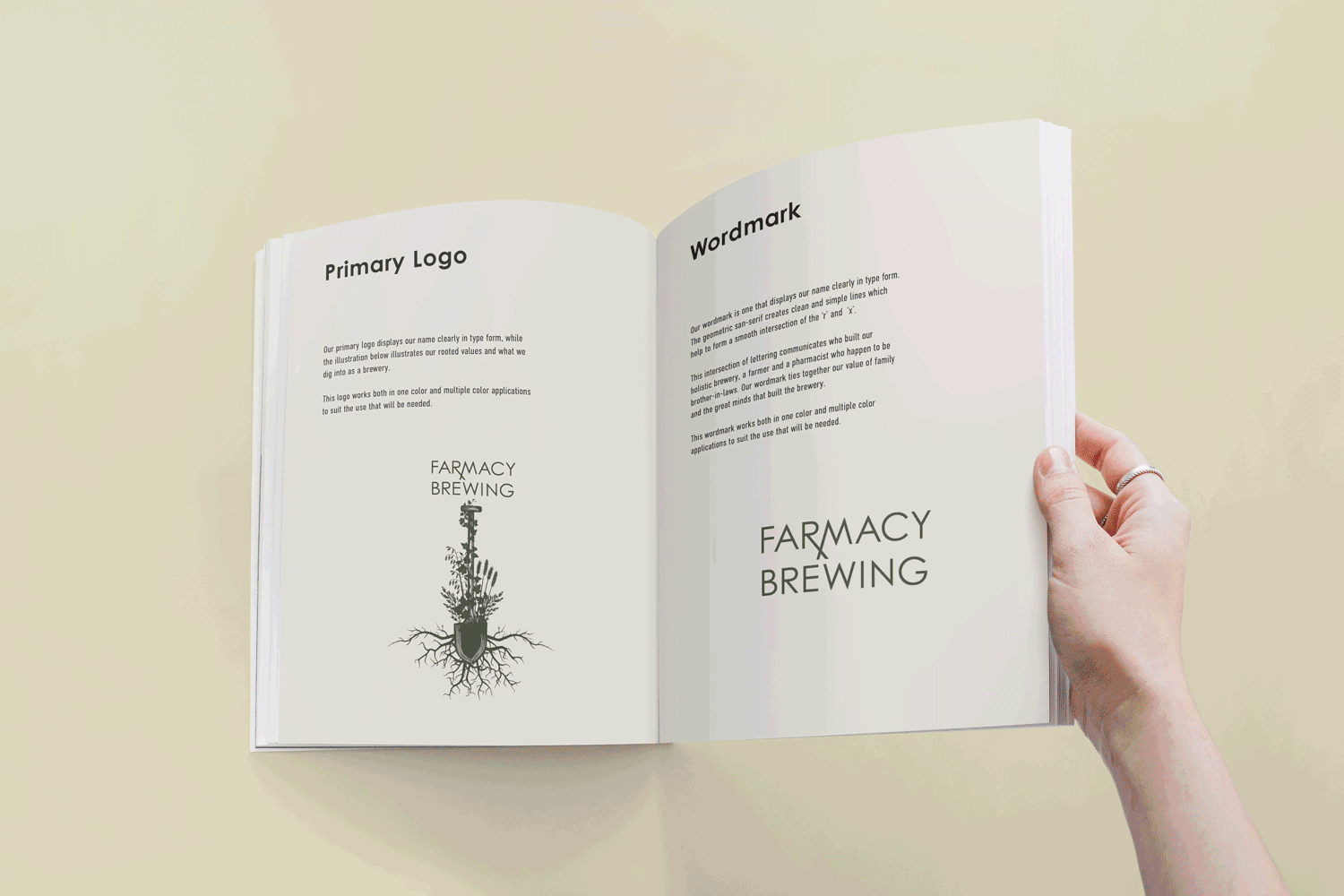
I illustrated a logo and wordmark that played the fusion of the farmer and pharmacist. The tail of the letter “R” and leg of the letter “M” are extended in the word “Farmacy” to overlap at the bottom to create the “Rx” symbol for a medical prescription. The accompaniment of the illustration helps visualize the connection between the nature of farmed ingredients and the science of brewing beer.


CRAFTING THE PACKAGING SUITE Once the brand identity was designed, I implemented it across the packaging and merchandise. The brothers wanted beer can labels to have a cohesive style, to be fun, and to have their own unique marker. The can labels for each brew maintain consistency in layout but offer variation in color.


DEVELOPING THE MERCHANDISEThe suite of submarks created within the brand identity adorns the merchandise that consumers can purchase. These items, made from sustainable, eco-friendly materials tie the consumer back to the vision of Farmacy Brewing.


Previous: